The right product metrics are the ones that connect directly to your growth framework — not the ones that are easiest to measure or most likely to look good in a board deck.
At EverQuote, the north star was qualified lead volume - not total lead volume, not site visits, not form completions. Everything else on the dashboard existed to explain why that number was moving. When I came into Arkadium as a fractional advisor, the team was tracking dozens of metrics across games, sessions, and ad revenue, but had no single metric that forced a conversation about whether the business was healthy. DAU was the answer - not because it's always the right metric, but because at a casual gaming platform, daily return behavior is the proxy for everything else: engagement, monetization, and long-term retention.
Here are the seven metrics I come back to most consistently, what each one is actually telling you, and the failure modes I see when teams misuse them.
Metrics that measure activity rather than outcomes are a symptom of a missing product strategy. If the team cannot explain why moving this number matters to the business, the metric is not the right one.
1. Monthly Active Users (MAU)
MAU is the most widely tracked metric and the most widely misunderstood. The number only means something if you have a precise definition of 'active.' Active means the user took an action that indicates engagement with your core value proposition - not that they received a push notification and opened the app.
The most useful conversion metrics combine quantitative signals with qualitative evidence — the data tells you where the problem is, the user research tells you why.
MAU without a precise definition of 'active' is a vanity metric. The definition is the strategy - it tells your team exactly what behavior you're optimizing for.
2. Customer Acquisition Cost (CAC)
CAC is only useful when it's fully loaded and channel-segmented. Blended CAC - total marketing spend divided by total new customers - hides the economics of individual channels and makes it impossible to know where to invest more or less.
The mistake I see consistently: teams calculate CAC from marketing spend only and exclude sales team cost, onboarding cost, and the cost of churned trials. That's not CAC - that's the cost of the lead. The real number is often 40-60% higher, which changes the CAC/LTV calculation significantly and sometimes changes the entire business model.
3. Customer Lifetime Value (LTV)
LTV is a prediction, not a measurement. The calculation requires assumptions about churn, upsell rate, and future pricing that are almost always optimistic when the business is early. The version I trust is backward-looking LTV by cohort - what did customers acquired in Q1 2023 actually spend over the following 24 months.
The ratio that matters is CAC/LTV, and the benchmark I use is 3:1 - you should be generating at least three dollars of lifetime value for every dollar you spend acquiring a customer. Below that, you're subsidizing growth. The Arkadium business had healthy LTV in its core subscriber segment but was subsidizing too much with display advertising economics. Isolating the subscriber cohort told a completely different story than the blended number.
Backward-looking LTV by cohort is more useful than forward-looking LTV models. What did customers acquired two years ago actually spend? That's the number to build a business on.
4. Churn Rate
Churn is the most lagging of the core metrics - by the time it shows up in your monthly numbers, the customer decision to leave was made weeks or months ago. The leading indicators are what matter: declining session frequency, support ticket volume, and feature adoption rates all predict churn before it appears in the cohort data.
At Ellevation Education, churn in the edtech SaaS business was heavily concentrated in the first 90 days of an annual contract - districts that hadn't achieved implementation milestones by 90 days were dramatically more likely to not renew. That pattern turned churn from a lagging revenue problem into an onboarding execution problem. The fix was in the implementation playbook, not in win-back campaigns.
5. Net Promoter Score (NPS)
NPS is most useful as a diagnostic tool, not a performance metric. A score of 42 doesn't tell you much. A score of 42 in which your detractors are concentrated in a specific user segment, a specific feature, or a specific acquisition channel - that's actionable.
The follow-up question matters more than the score. 'What is the one thing we could do to improve your experience?' asked of detractors surfaces the specific friction your quantitative data can't see. I've used NPS qualitative data to prioritize roadmap decisions at multiple companies when the quantitative signal was ambiguous.
NPS as a score tells you your direction. NPS qualitative data tells you what to do next. Invest in the follow-up question, not the number.
6. Product-Market Fit Score
The Sean Ellis question - 'How would you feel if you could no longer use this product?' - is blunt but effective. The 40% threshold for 'very disappointed' responses is a heuristic, not a law, but it has proven reliable enough across enough products that I use it as a starting point.
The more useful version of this question is directional: is the percentage trending up or down as you ship? At a solar marketplace I advised, we ran this survey at 90-day intervals during a product overhaul. The 'very disappointed' percentage went from 28% to 41% in six months - not because we shipped everything on the roadmap, but because we identified the two or three features that the most engaged users depended on and prioritized those specifically.
7. Activation Rate
Activation rate is the metric that most directly reflects whether new users are experiencing your product's core value proposition. Low activation rate means the gap between what you promised in acquisition and what you delivered in the product is too wide.
At Alleyoop, we defined activation as a student completing their first personalized study plan within 72 hours of registration. When we optimized specifically for that event - reducing steps, adding guidance, removing friction - we saw a 35% decrease in cost per registration because the cohorts that activated were significantly more likely to convert to paid. Activation was the lever that connected acquisition economics to retention.
Activation rate is where acquisition economics and product quality intersect. A low activation rate usually means the promise you made in the ad is not being delivered in the first session.
How I Use These Metrics in Practice
The framework I use across every engagement: one north star metric that the entire team can influence, three to five supporting metrics that explain movement in the north star, and a clear distinction between metrics you act on and metrics you monitor.
The mistake I see most often is teams treating all metrics as equally important and optimizing everything at once. At Arkadium, DAU was the north star. D7 retention and ARPDAU were the supporting metrics. Session length and game starts were monitoring metrics - they helped diagnose why DAU was moving, but they weren't things we were directly trying to optimize.
That hierarchy is what makes a dashboard useful. Without it, you have a reporting tool. With it, you have a decision-making instrument.
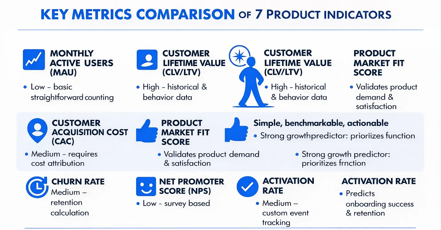
Key Metrics Comparison
| Metric | Implementation Complexity 🔄 | Resource Requirements ⚡ | Expected Outcomes 📊 | Ideal Use Cases 💡 | Key Advantages ⭐ |
|---|---|---|---|---|---|
| Monthly Active Users (MAU) | Low - straightforward counting | Low - basic tracking systems | Baseline user engagement, growth trends | Subscription, social, SaaS products | Easy to communicate; standardized |
| Customer Acquisition Cost (CAC) | Medium - requires cost attribution | Medium - marketing & sales data | Measures cost efficiency of acquiring customers | Marketing channel optimization, ROI analysis | Ties marketing spend to outcomes |
| Customer Lifetime Value (CLV/LTV) | High - complex predictive modeling | High - historical & behavior data | Forecasts long-term revenue per customer | Retention strategy, budgeting, segmentation | Justifies acquisition spend; strategic planning |
| Churn Rate | Medium - retention calculation | Medium - user activity data | Indicates customer loss & satisfaction | Subscription businesses, retention focus | Directly reflects satisfaction; proactive retention |
| Net Promoter Score (NPS) | Low - survey based | Low - survey tools | Measures customer loyalty & satisfaction | Customer experience management | Simple, benchmarkable, actionable |
| Product-Market Fit Score | Low - survey based | Low - user feedback collection | Validates product demand & readiness for growth | Early product validation, strategy decisions | Strong growth predictor; prioritizes features |
| Activation Rate | Medium - custom event tracking | Medium - product analytics | Predicts onboarding success & retention | Onboarding optimization, user engagement | Correlates with retention; identifies friction |
Are You Tracking the Right Metrics?
Metric selection and dashboard design are often where I find the most leverage in a new engagement - teams that are measuring the wrong things are working hard in the wrong direction. If you want an outside perspective on whether your metrics are actually driving the right decisions, let's talk.